|
Technology changes quickly and it can be hard to believe how much has changed even in the last few years. 10 years ago the best selling mobile phone was the Nokia 1110 which has a black and white display with highlights being 3 inbuilt games and text picture messaging!
Now smartphones are mini computers with the power for people to connect wherever they are. This is why it is important to make sure that your church website can be browsed on a mobile device.
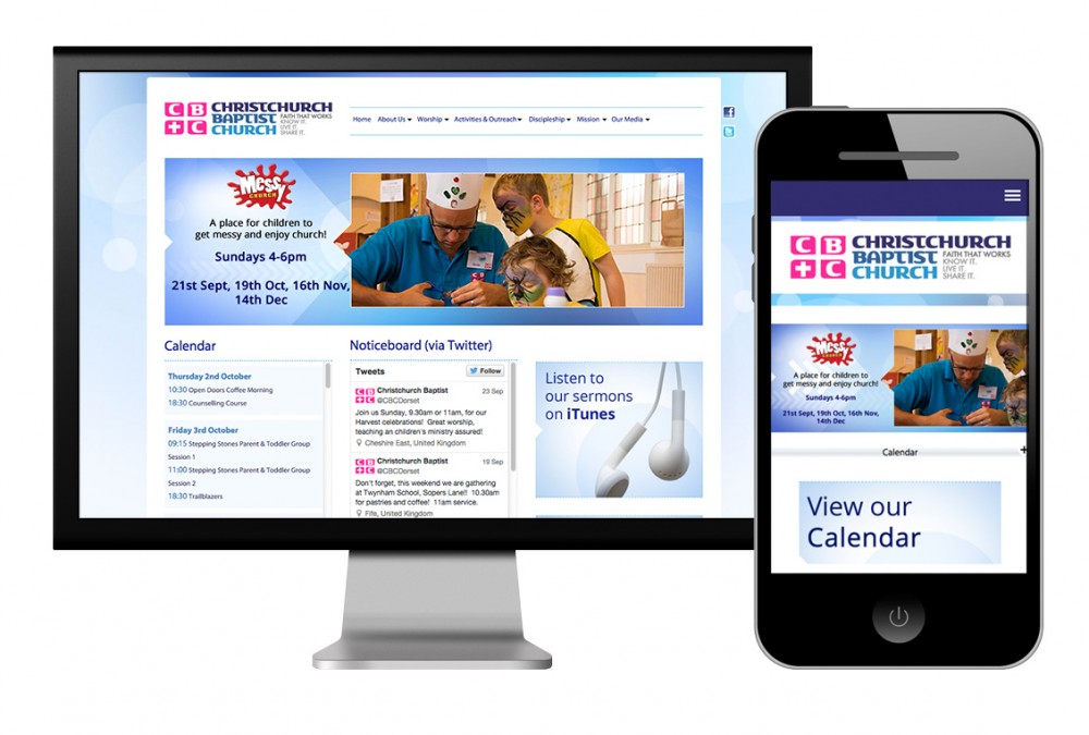
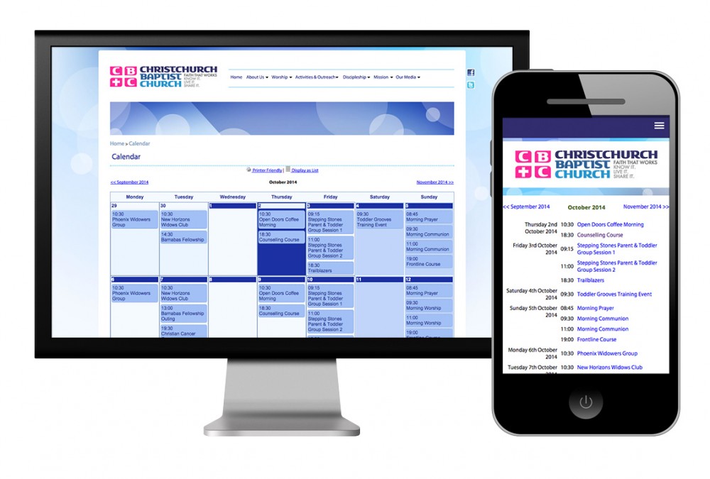
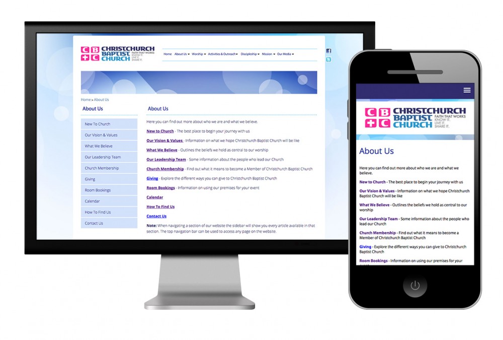
Having a mobile version of your church website will display the website in a format that is friendly to being viewed on the smaller mobile screen. Each page will be formatted slightly different to the desktop edition as the following screenshots shows:


In addition to having a mobile version there are some other considerations for making your website better for mobile devices:
- avoid Adobe Flash within your site as this does not work on some mobile devices including all Apple iPhones and Apple iPads.
- when adding tables to your website for layout, use percentages rather than fixed width. If a mobile browser is 400px wide and you’ve added a table that is 700px wide then it may look fine on the desktop browser but on the mobile it will cause the page to scroll. It is a much safer way to add the table width as a percentage (ie 100%).
- compress photos - make sure that any photos you add are reduced in size. A photo taken from a camera or smart phone may be a few MB large and this can be slow to download/ use up the download limit on a user's smartphone. Make sure that you compress photos first. See our guide for more details. If you use Church Edit then your photos are automatically compressed for you.
- avoid really long pages - this is a good tip for all websites but particular when it is being read on a smaller mobile device.
- easy navigation - have a clear menu structure so that people can find their way around the site. Don’t have too many first level links in the menu but create sub sections if needed.
All of our Church Edit websites are mobile friendly (if yours is not enabled then just go to SETTINGS > SITE OPTIONS to turn this on).
| 


